Splashmob
Empowering musicians and artists to interact and engage with audiences in real-time using augmented-reality.
My Role
Interaction + Visual Design Lead, UX Research
Tools
Adobe XD, Figma, Mural, Procreate
Team
CEO/Founder
CTO
Head of Business
3 Product Designers
Duration
May 2020 - June 2020
Overview
Splashmob empowers venues, artists, and performers to interact with and engage with their audiences in real-time.
Splashmob's aim is to provide a more engaging experience for the audience by pushing the limits beyond just sending a comment or an emoji.
This project was done in collaboration with the Splashmob CEO/Founder, CTO, Head of Business Development, and four UX/UI designers. This project lasted three weeks in a remote work environment with daily stand-ups from May 2020 to June 2020.
Project Scope
To put things simply, Splashmob can be easily used by scanning a QR code through a person's mobile device. Many tech companies like Amazon, Spotify, Instagram, and Snapchat use it as a way for users to have a more interactive and engaging experience using their mobile application.
Splashmob's vision and mission is to create those engaging experiences for musicians and performers to better connect with their fans on a deeper level.
The Problem
Splashmob wanted to work on the user interface of their current dashboard and controller, and also go into further research on what the platform should look like, based on the users wants and needs. Musicians and performers have difficulty connecting with their audience on a deeper level and need a way to create engaging experiences as an addition to their performances in order to leave a lasting impression on their audience.
Remote Work Environment
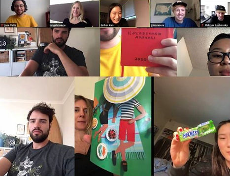
Due to the COVID-19 Pandemic, we worked with the Splashmob team in a remote work environment and used Zoom for video meetings and Slack for communication purposes.

Interviewing Ideal Users
We wanted to interview users to get a better understanding of how potential Splashmob users were using digital platforms to reach their audiences.
To start, we interviewed 5 participants (3 live streamers, 1 musician, and 1 contemporary artist) to learn more about their experiences, goals, and frustrations of using digital tools to reach their fan base.


User interview responses from participants

Some key findings of these user interviews were:
-
80% of users do not have an engagement strategy
-
Social media was one of the most important tool for users to connect with their fans
-
Social media integration would be ideal in a digital platform
-
50% of users said certain platforms did nothing for their fan size
-
80% of users expressed frustration in the onboarding process and difficult-to-use platform
-
60% of users prefer "easier" and "more affordable" platforms that have a fluid workflow
Analyzing Popular Digital Platforms


Through an extensive surveys already done by UCLA, we decided that emphasis on a new design of the controller and the desktop were key areas that were the most important. For our initial research, we looked into popular digital platforms like Twitch, iMovie, Google Slides and StreamLabs to get a better understanding of how they were providing ways for users to engage with audiences.
Through the analysis, we were able to compare:
-
Visual designs
-
Features
-
Content
Through the analysis, we were able to condense:
-
The user experience of adding in media
-
The workflow of creating a presentation
-
The key features of the platform to make more sense for users
Pivot #1 :
Needing More Concrete Research
Our initial research, user interviews, and persona creations were done mainly on live streaming users because our client had emphasized that it would be an ideal opportunity in the future for Splashmob. There was a misunderstanding of ideas between the client and my team and we quickly learned that Splashmob's current main goal and priority was to focus on building out a fluid augmented tool for live performances, not live streaming.
In an effort to pivot our research, we did more concrete research on different augmented tools out on the market. We looked into specific competitors that offer similar products like Splashmob for musicians and performers. We looked at platforms like Vizrt, Mimu Gloves, and Digital Moo.

Vizrt
-
Makes it possible to support a fast pace workflow
-
Minimal physical and effort-based input
-
Helps better connect with viewers
-
Highly customizable and used for multiple purposes: marketing, advertising, and entertainment

Mimu Gloves
-
Connect movements and gestures to MIDI / OSC
-
Presets for Ableton Live and other major software
-
Create projects for one song or a whole show
-
Video tutorials and documentation
Understanding Potential Users on a Deeper Level
To keep the ball rolling in the research phase, we conducted four more remote user interviews specifically with musicians that had a fan base of 20,000+ and had previously done live shows. We also reached out to two users who were on the talent side on the enterprise level and had experience working directly with musicians and DJs.
+2 enterprise level
+2 musicians
Some key findings of these user interviews were:
-
100% of users wanted to share their (or a talent's) story with audiences
-
100% of users wanted to create fun and memorable experiences
-
100% of users were concerned with how much revenue they made at an event
-
100% of users wanted more creative ways to keep their audiences engaged
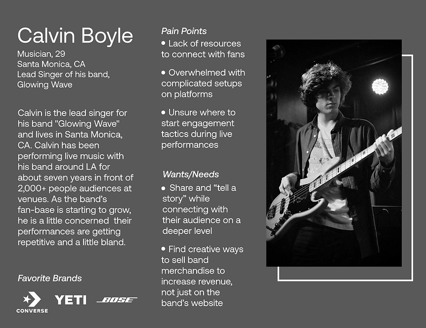
Building out the Primary Persona
With the key findings from user interviews, we were able to elaborate in more detail, our primary persona. Taking into consideration all of his pain points and goals, we broke down the patterns from the user interviews and created Calvin, a musician from Santa Monica.
.png)
Breaking Down the User Journey
To understand even more the emotions, feelings, and frustrations of our persona, Calvin, we created a journey map to show even though a musician may have a large fan-base, they still are unable to connect with their audience on a deeper level during a live show.
.png)
Empathizing with Users
With the responses from user interviews, we also created empathy maps so Splashmob senior leadership could better understand the wants and needs of potential Splashmob users. It also was useful in narrowing down what specific features would make the most sense in the platform for users.
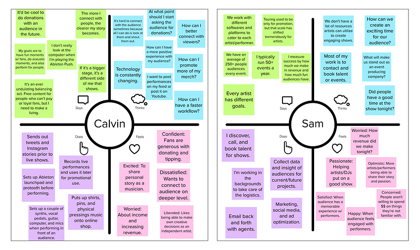
Primary Persona
Enterprise Level
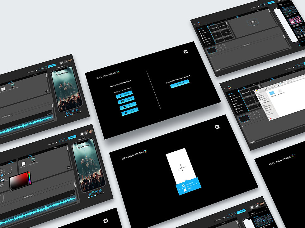
To visualize our ideas of what the dashboard and controller of Splashmob would look like, we did a Design Studio and created sketches as a team. After we drew out our sketches, we reconvened and converged all of our ideas to see which features would be the most ideal for the platform in terms of users' wants and needs.

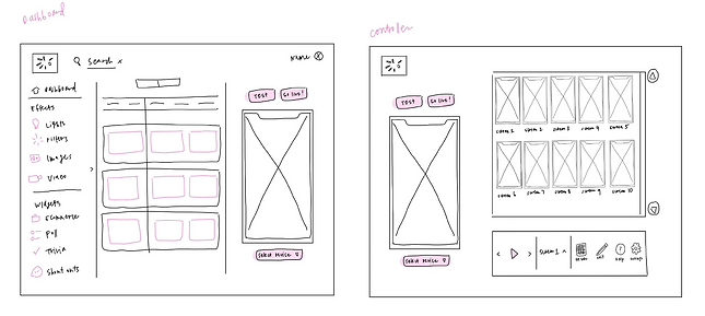
Visualizing the Platform
Digitizing the Platform
After creating sketches, we put our sketch ideas into digital medium fidelity wireframes to provide more detail and a more concrete idea of what the platform would look like visually, focusing on key features like the import process of adding audio and visuals.


Testing the Features of the Platform
Through usability testing we were able to find key findings of flaws in the design and saw where it needed to be improved for users to have a positive and smooth experience.
9
participants
5
tasks
remote and moderated


Testing outcomes on Google Sheets (red - opportunities)

Unclear Menu Options
When given the task to add audio to a project, 50% of participants assumed audio would be under media even though there was an audio tab at the bottom of the sidebar menu with a music icon.
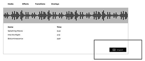
Feature Assumptions
100% of participants expressed frustration with the import button and thought it would be a ‘drag and drop feature’ after adding media into a project. Participants also felt that there were too many steps to add files.
Pivot #2:
Refining Icon Visualizations
Going through usability testing, what we thought would be very clear to users like translation of icons and the flow of the dashboard was not as comprehensible for users as we thought.
With the "widgets" being an important feature of the dashboard and controller, we made efforts to make it easier for users to understand. With no other cues besides the icons, users were not sure what each icon meant and it made the process for users longer and more frustrating than we had expected.
To solve this problem, we kept both menu tabs on the left and at the top. We also condensed down the left menu icons, but added text next to each icon to avoid confusion.
BEFORE

AFTER

Making Improvements to the Design
With our usability testing findings, we improved our wireframes’ functionality and ease of use so that users could have a more efficient and faster workflow. We worked on specific features of the help menu panel, the clarification of icons, and the import process.
Similar "drag and drop" feature frequently seen in Mac. Providing users two options to drag and drop or double click files into the platform for easier import process.
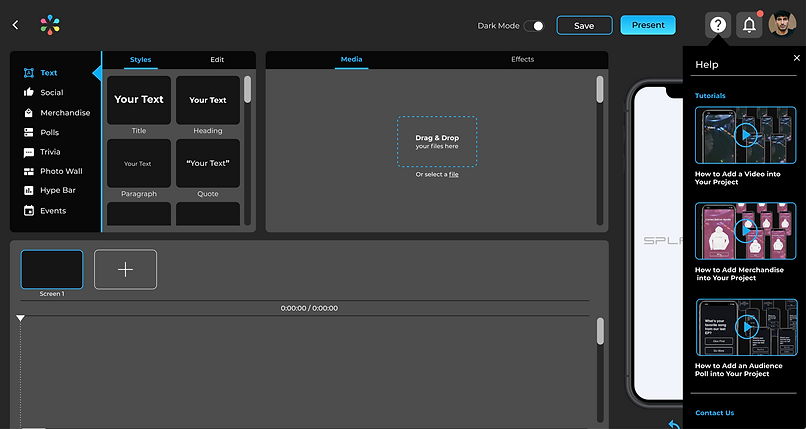
A key finding we found in user interviews was the frustration of difficult-to-use platforms. To guide users to easily troubleshoot, we filled the help menu with short tutorial videos and an option to contact the Splashmob team for more assistance.
We made multiple iterations to the style and visualization of the icons. During every round of user testing, we saw users constantly struggle identifying each icon's purpose and meaning. In the final mock-up, we condensed down the icons to the most important ones from a business standpoint and labeled each one to help avoid users from being confused.
Final Prototype

Room for Improvement
If we had more time, we would...
Build Out Templates
We wanted to offer templates that would match users based on their occupation from musicians to educators. To do this, users would be able to easily create their desired presentations or shows based on their background.
Include Data Analytics
With data visually showing success or shortcomings so easily nowadays because of social media, it would be ideal for users to see where there was high engagement or places where it was lacking to continue building out successful engagements with audiences.
Dive Deeper into Features
With so many features implemented into the platform, we did not have time to break down every single feature. We would want to dive deeper into specific features like Merchandise and Effects because most users would prioritize those features over others.
Why this project made me a better designer
Things that I learned...
Pivots can happen anytime.
This was definitely one of the most challenging parts of this project -- the many pivots that happened. It is important as a UX/UI designer to be flexible and adapt to the project in order to accomplish both user needs and business goals. The extra research and the long nights can be extremely tiring, but remembering that it will be helpful for the client and most importantly, the users is most important.
Because this project was done in a remote work environment, there was a moment where communication was not clear from the stakeholder's side. It is key that everyone is on the same page and if there needs to be clarification, questions have to be asked. Miscommunication will undeniably happen in any project, but being able to think and work even through stressful moments is really important to create a successful product.
Communication is everything.
Results
After we created the dashboard and controller for the platform, we presented our research findings and final prototype to our client, Splashmob.
The Splashmob leadership team were pleased with the outcome of the final prototype and decided to develop our prototype into their current Splashmob platform. The development is still in process, going through testing with potential clients, and is expected to release soon.
Through usability testing and design iterations, we were able to increase user workflow by 18% and reduce user time from 50 minutes to 40 minutes.