A redesign of an e-commerce store that specializes in quality greeting cards, stationery, gifts, and pens & pencils in Los Angeles, CA.
My Role
Sole UX/UI Designer
Tools
Sketch, Figma, InVision, Miro, Procreate
Duration
2 weeks (March 2020)
Overview
The Social Type is a small business that specializes in quality greeting cards, stationery, journals & planners, gifts, and pens & pencils located in Los Angeles, CA.
They opened their brick and mortar shop as an extension of their wholesale brand in 2016 in the Silver Lake neighborhood of LA.
As an opportunity to support the local community, The Social Type spun up their own website so that people could browse their products worldwide.
However, it doesn't provide an easy way for customers to purchase products. Customers feel that there are many flaws to the website.
I was the sole UX/UI Designer for this redesign project and it lasted two weeks.


Where are the existing problems in the current site?
To get a better understanding of the problems in The Social Type ecommerce store, I performed remote and moderated usability testing on the current site with five individuals who regularly purchase stationery, greeting cards, and also frequently shop online. These are some key findings and quotes from usability testings that break down the problems:

Overlapping Menu Items
"Why are there overlapping menu items? From the store means... like in-stores? That's confusing. Do these two stationery pages go to the same place or different? I'm not sure which menu item is going to lead me to the right stationery I'm shopping for."

Unclear Visual Cues
"I thought something would pop up after I added my item into the cart. I didn't even see the notification below the button."

Limited Search Options
"Why isn't there an easier way to search for items on this site? "What if I don't want to just sort items?"
What are some solutions to these
existing problems?
By redesigning the current site and implementing an extensive search system, an intuitive menu navigation, and smart visual cues throughout the site, we will see the result of a decrease in the number of abandoned shopping carts.
What are the competitors doing and how?
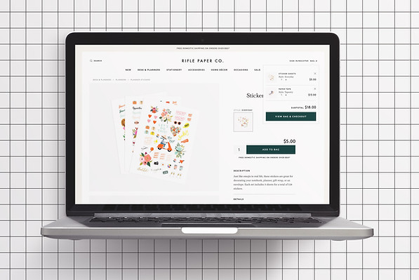
After undergoing usability testing, I did a C&C analysis for three companies that also offer similar stationery and greeting cards through an ecommerce platform — Paper Source, Rifle Paper Co., Sugar Paper LA and also, Everlane, who is known to have a great online shopping experience. I gathered information on specific features that would be useful for the consumer shopping with the redesign. The main takeaways from the C&C analysis were:
Organized Navigation
Well thought-out and organized global and secondary navigation systems were key for all competitors.

Pop-Up Shopping Cart
Pop-up shopping carts were commonly seen in ecommerce sites across the board to provide consumers with clear visual cues of the shopping experience.
Extensive Product Search
It was common to see competitors having filter options implemented, such as: color, price, brand, and etc. for faster search options.

Restructuring the Confusing Navigation
With very clear frustrations of participants during the usability testing, it was important for me to focus on restructuring the site map and simplify the global navigation for the site. Repeat of menu categories caused many users to be confused looking for certain products and therefore, taking longer to find items they were searching for. To restructure the navigation, I proceeded to do an open card sorting with seven participants. The new menu categories were new items, best sellers, greeting cards, stationery, journals & planners, gifts, and sale.

Sketching the Look and Feel
After building out the site map, it helped to map out how users would navigate the site to make a purchase. With that goal in mind, it was time to brainstorm ideas of what the site would look like as digital wireframes, focusing on the key findings from the C&C analysis and usability testing.

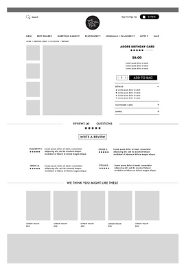
Digitizing the Shopping Experience
After rounds of sketching, my next step was to digitize the sketches into medium fidelity wireframes to continue building out the redesign of the ecommerce site.


Disconnect on Social Media and Online Presence
After creating digital wireframes in Sketch, I wanted to dive deeper into the new design aesthetics of the ecommerce redesign. Going through The Social Type's Instagram page, I realized that there was a disconnect with their aesthetics on social media and the ecommerce site. On Instagram, the brand seemed really fun, playful, and creative, but I didn't get that experience when I was browsing their current ecommerce site. Finding inspiration from the Instagram posts, I created a mood board and style guide to help me with further UI decisions of the redesign.


Final Prototype
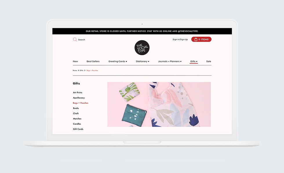
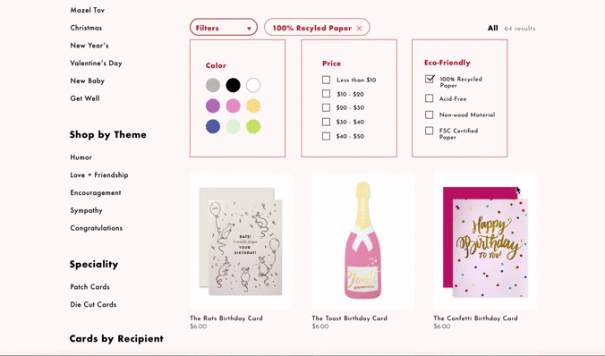
Extensive Product Search Engine
One of the feedbacks from usability testing of the current site was how users were frustrated with the difficulty of finding specific products they wanted to purchase. With the feature of filters on the site, users are able to quickly narrow down their search with just a few clicks and easily find the product they're looking for.
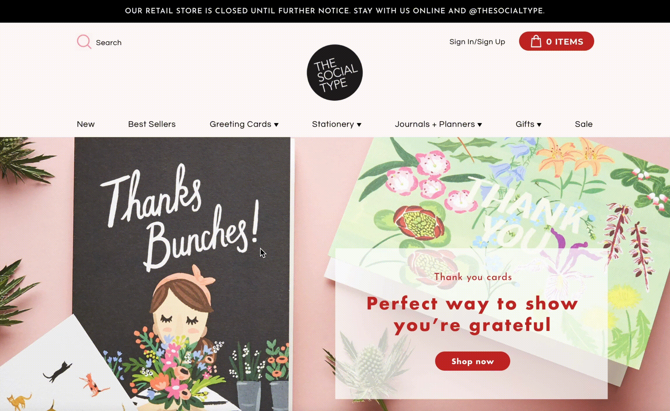
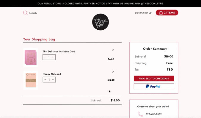
Pop-up Shopping Cart
With users not sure if the item was added to the cart was a huge problem that I wanted to solve. There were instances when users ended up having ten items in their cart, when they were actually only purchasing two items. I decided that a pop-up shopping cart box with very clear indications of items being added into it would help solve this issue.
Smooth Checkout Process
In the first round of usability testing with the current site, there weren't that many issues with the checkout process, but during a second round of usability testing there were users who were unsure which step they were in during the checkout process because visually the cues weren't there. With that problem in mind, I made clear indications of each step in the checkout process so users could have a fast and hassle-free ordering process.
Click through the entire prototype:
Room for improvement
If I had more time, I would...
Quick Payment Options
To add to the speed of the checkout process, I would integrate quick payment options: such as, Amazon Payment or Apple Pay to provide customers a quick and hassle-free checkout process.
Fluid Return Process
Returns or exchanges aren't available online and can only be done contacting the store via an online form or phone call. To save customers time, it would be fitting to integrate a smooth and easy return process.
More User Testing
Do more usability testing on the final prototype to find further flaws in the redesign and implement those changes to create an even better experience for shoppers.
Why this project made me a better designer
Things that I learned...
Iterate, iterate, iterate.
A redesign doesn't mean that it stops there. There are always ways to make a design even better than it already is. Iterations can be time-consuming and long, but it's important to address the changes that need to be made to make the user experience as positive as possible.
Be flexible and open-minded.
As the redesign progressed, I had very clear goals and ideas of what the redesign would look like. However, along the way of doing more research, there were original ideas that had to be completely scrapped. It's important to not be so attached to one idea, but also be open-minded to see what makes the most sense and will provide the best experience for users.
Results
Through usability testing and design iterations, I was able to decrease the search process of finding a specific item from 7 minutes to 2 minutes with the filtering process and the new navigation system.
With the checkout process, 100% of users were able to go through the checkout process without any confusion and no misclicks.